Brief
Lena is a personal project, a memory archive built to capture and organise memories in a way that feels authentic.
The design problem was holding two opposites together. Memory wants to feel grounded and permanent, so the brand needed weight and stillness.
But the product is something you live in and revisit, so the interface needed to feel alive and rich without tipping into noise.
Brand and interaction design had to read as one coherent thing rather than two layers stacked on top of each other.
Outcome
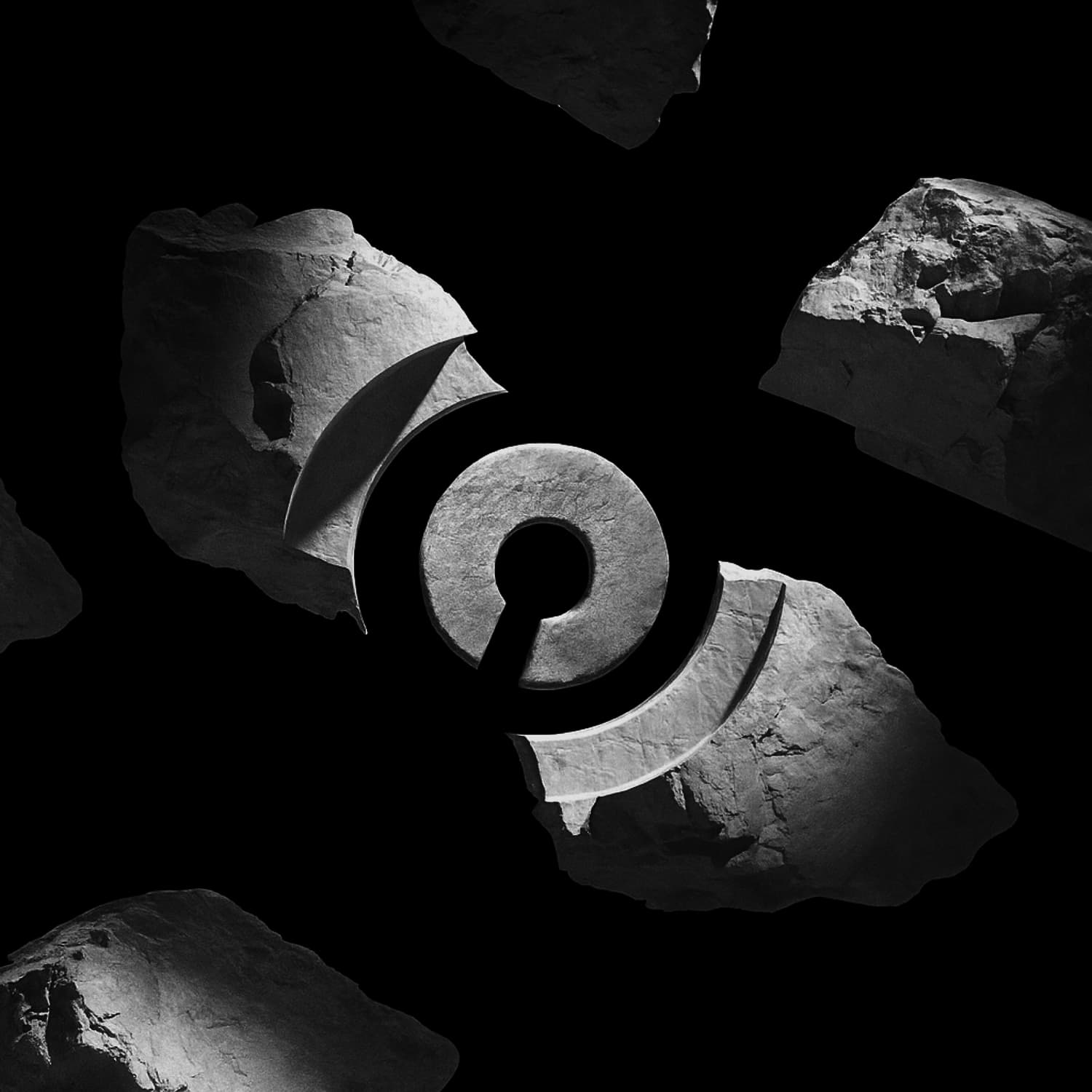
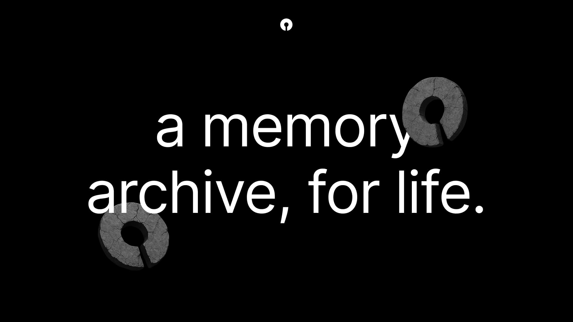
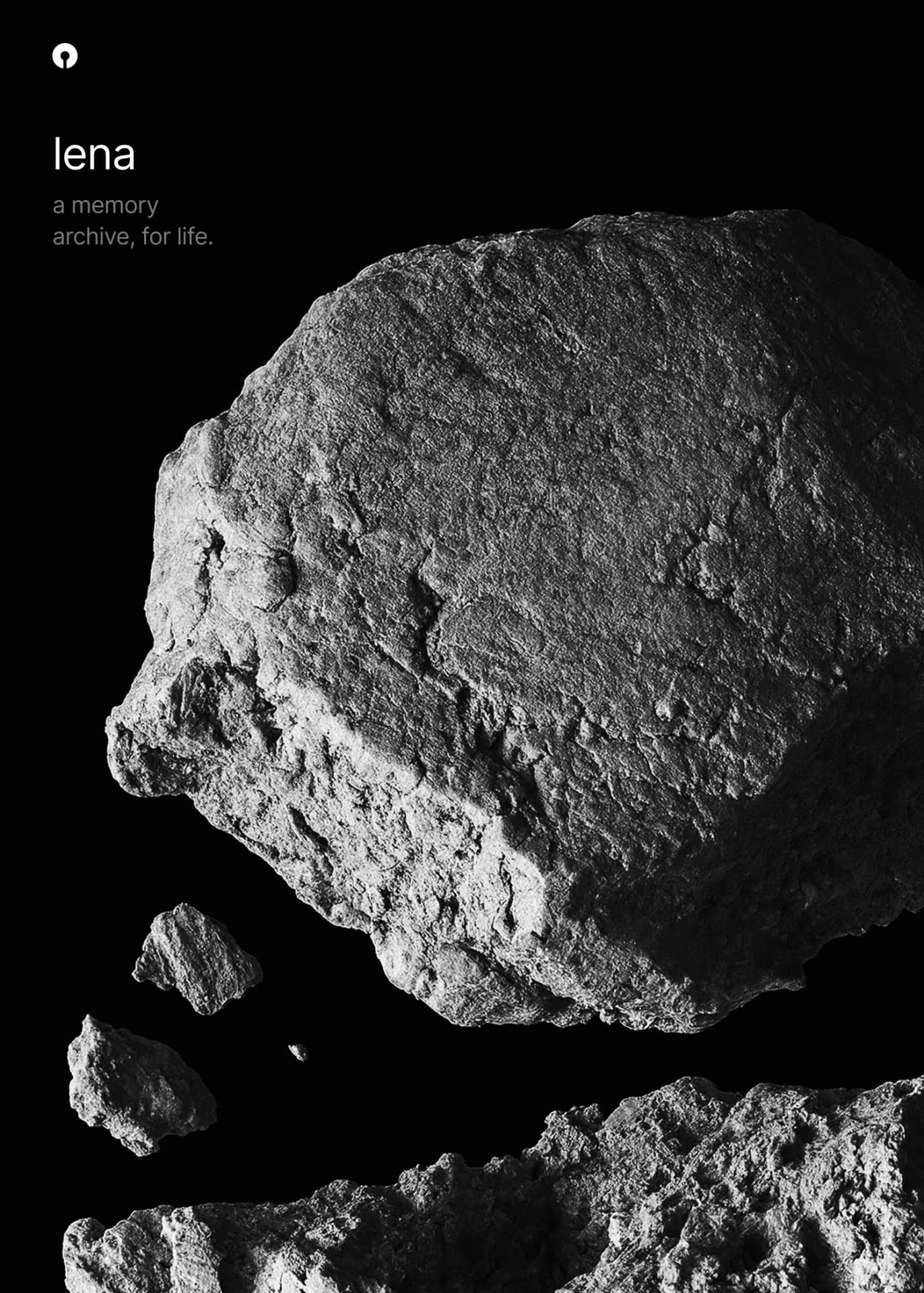
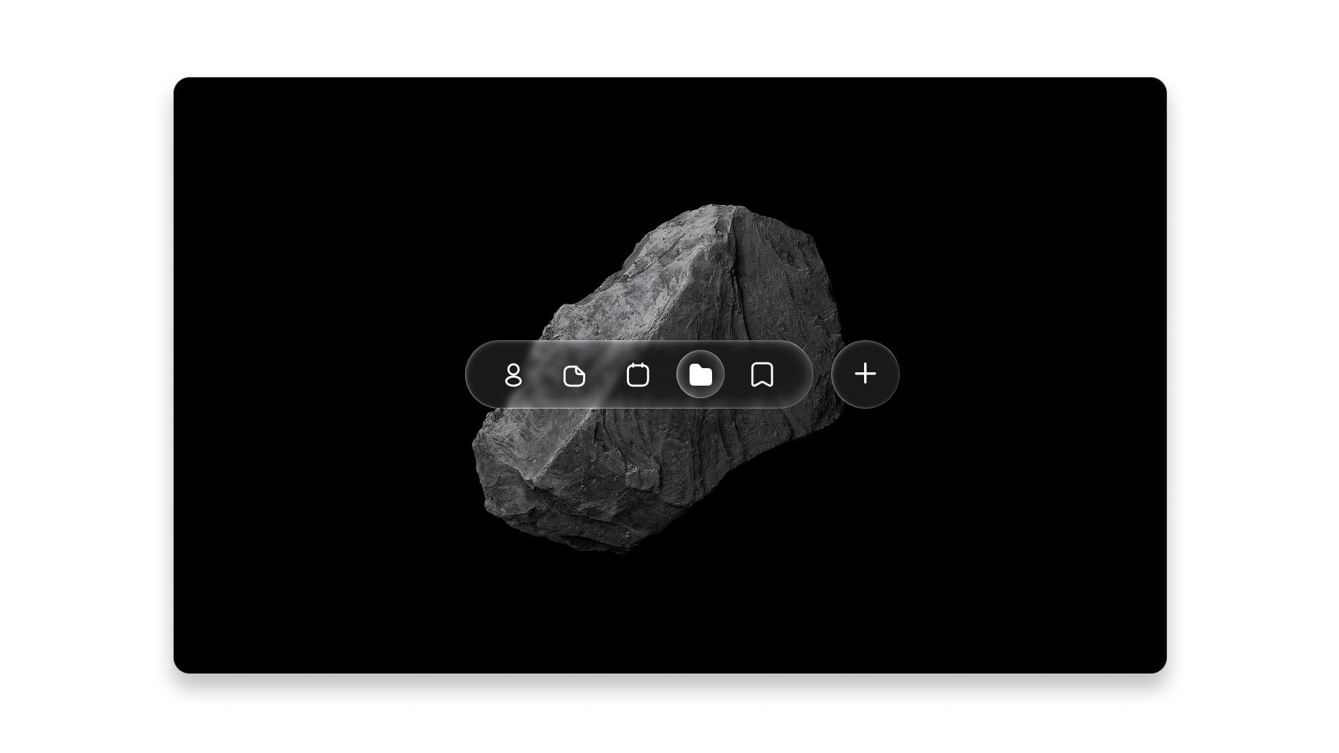
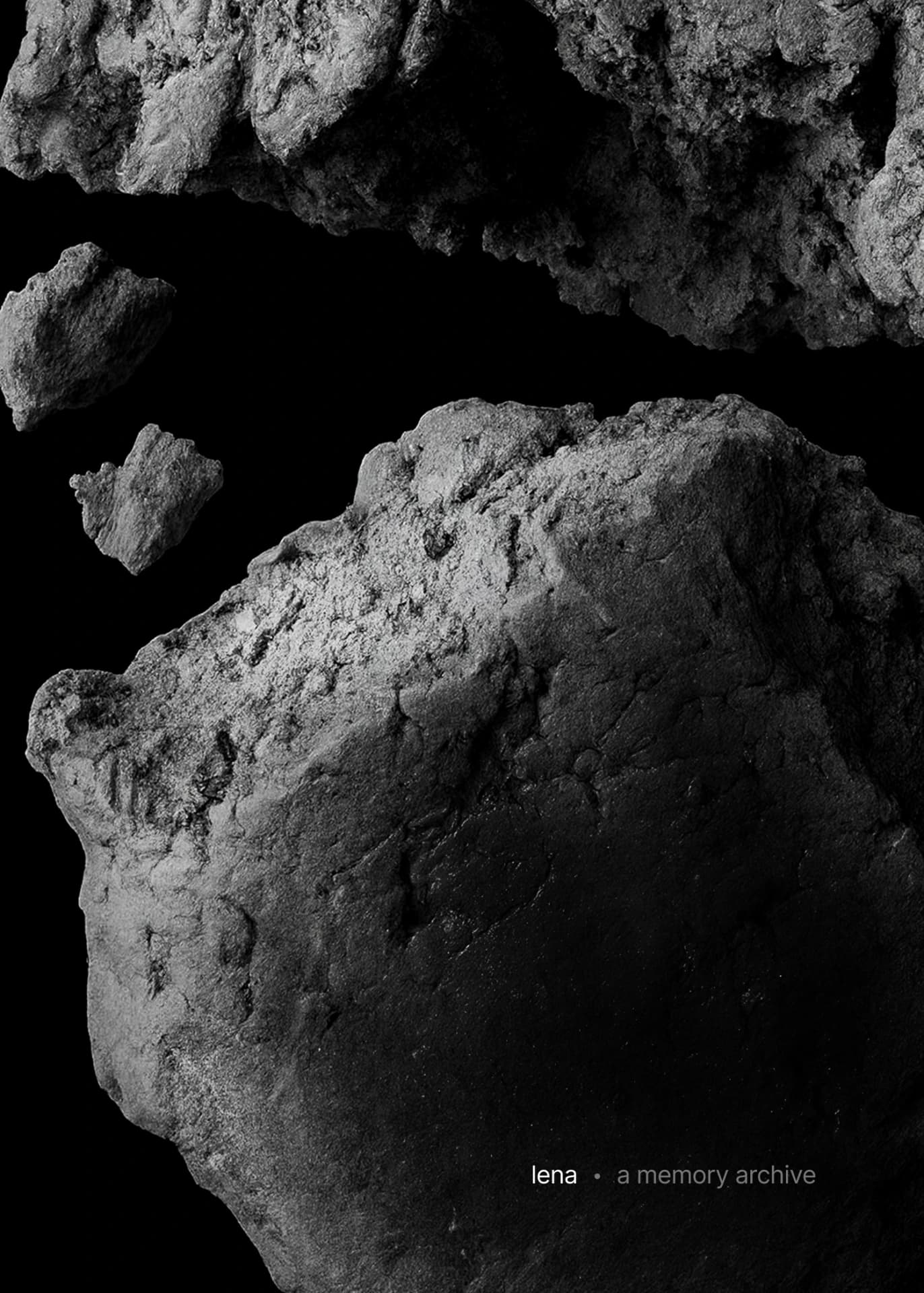
The mark is a single geometric form, a circle with a cut, echoing how memories are displayed in the app. I anchored the visuals with desaturated, cool-toned rocks, used sparingly across marketing so the brand stays recognisable without competing with the product.
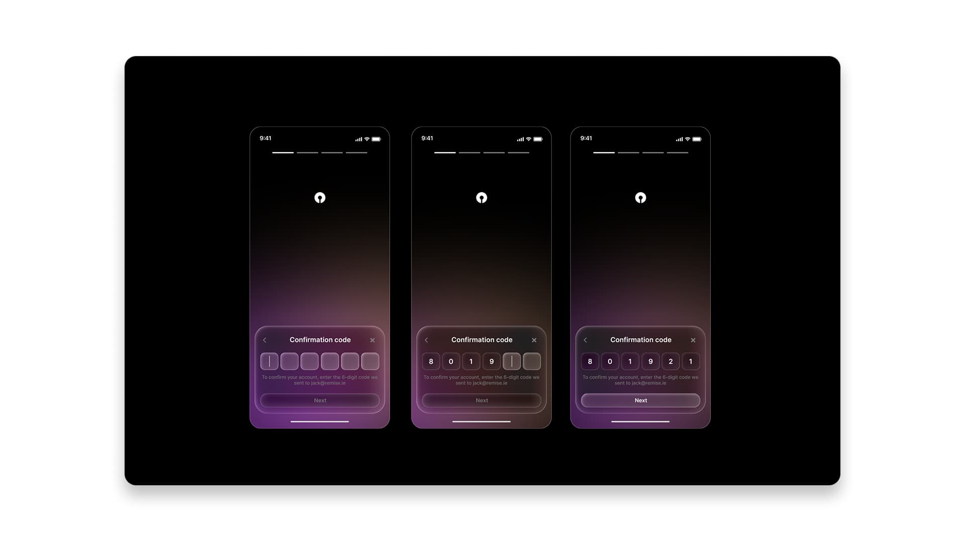
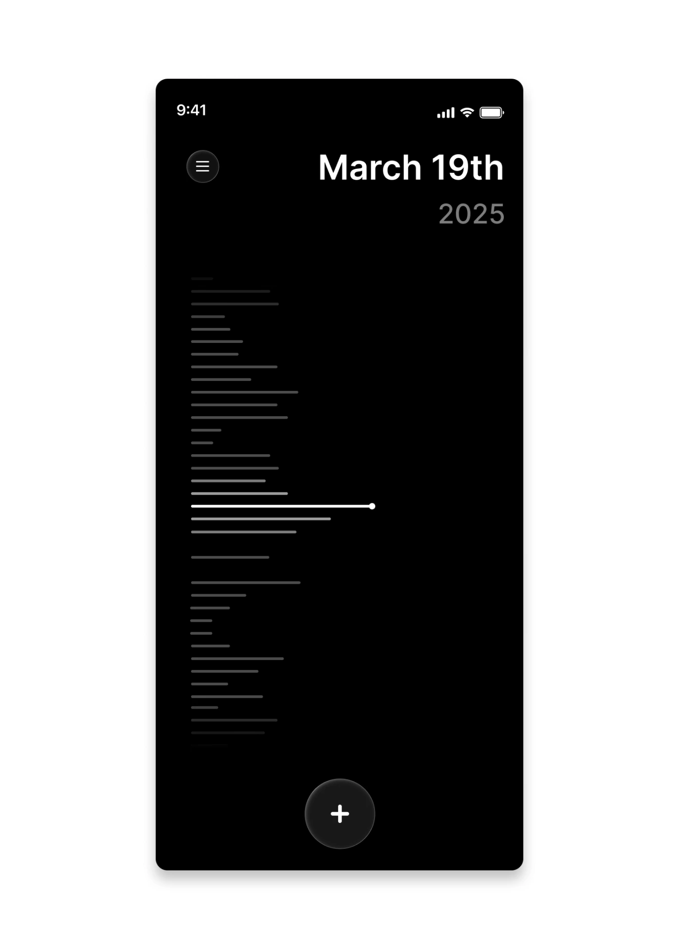
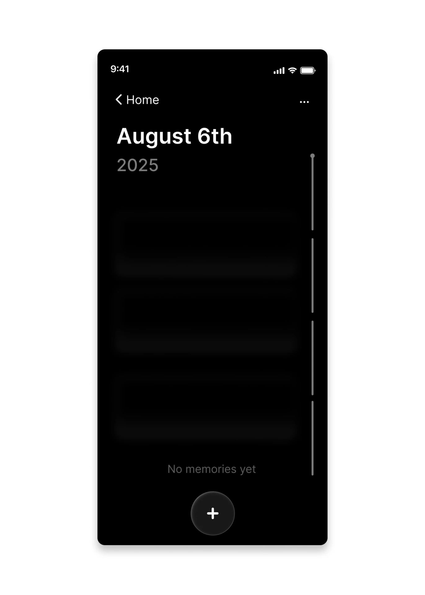
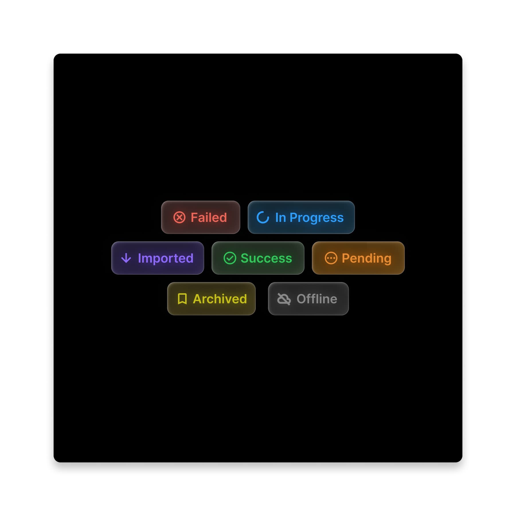
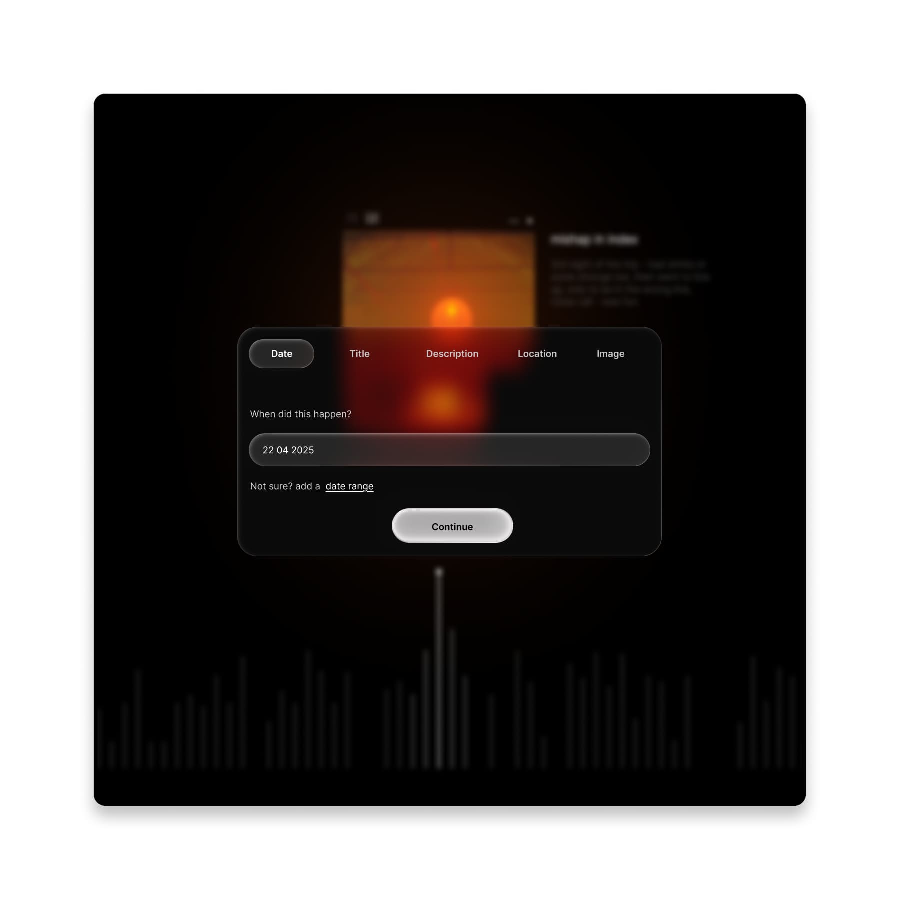
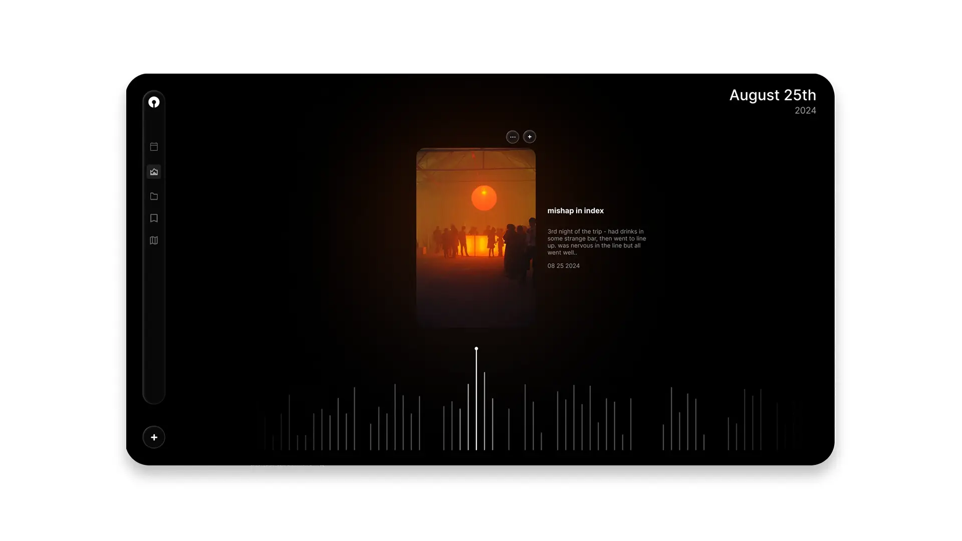
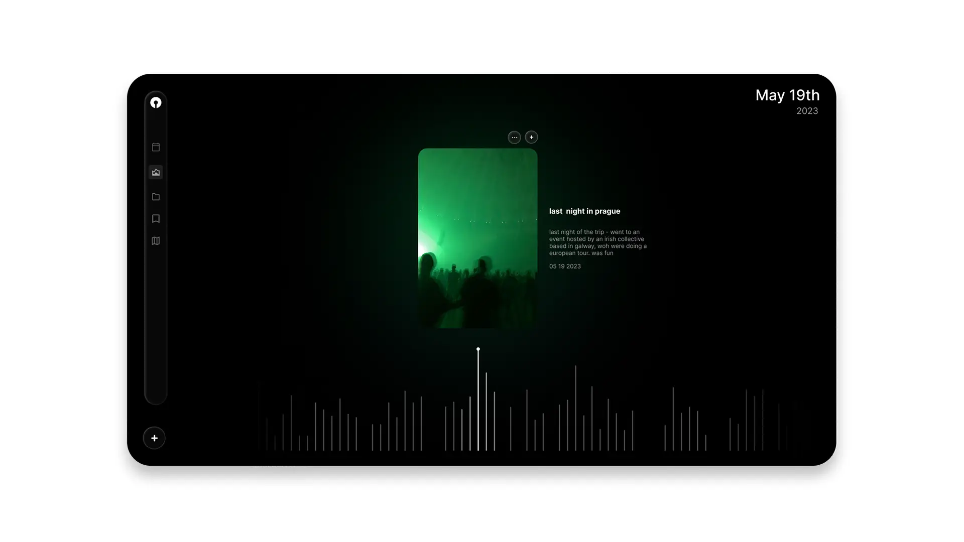
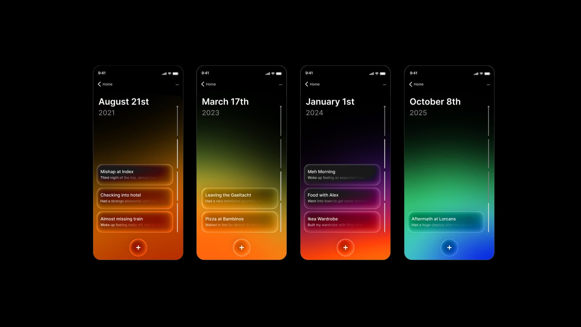
The interface is organised around clarity and rhythm: clean typography, strong contrast and subtle gradients form a visual timeline that’s easy to scan on both mobile and desktop. Motion is kept light, with small animations, expandable panels and contextual controls. On mobile it shifts to quick, scrollable navigation closer to an Apple Watch’s fluid UI, keeping movement through memories low-friction.