Direction for Geese’s ‘Getting Killed’
Sep 24, 2025 · Jack Sheehy
Geese's third album is called Getting Killed. It's a title that doesn't resolve cleanly and leaves a lot to the imagination. It could mean exactly what it says, or it could mean the opposite. Phil Gibson handled the creative direction across the project, covering both the photography and design. With the work sitting comfortably in that same ambiguity.
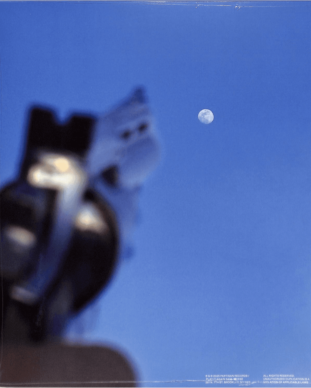
The photography has a consistent register throughout. The subjects aren't posed in any obvious way and props appear as part of the world rather than as styling decisions. These things aren't explained which is probably the right call for an album with this much going on thematically.
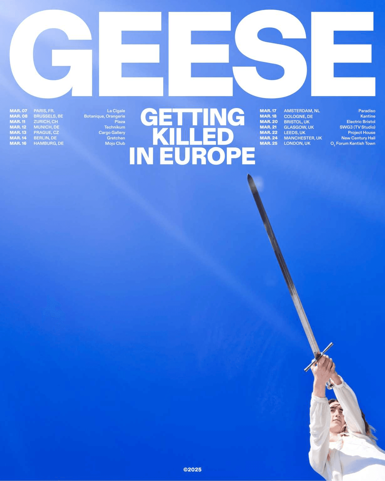
Where the visual direction gets interesting is in what it doesn't do. Getting Killed covers a lot of ground lyrically and sonically and the easier approach would have been to reflect that density back outward. Instead the imagery stays somewhat minimal. The visual language doesn't try to summarise the sound.
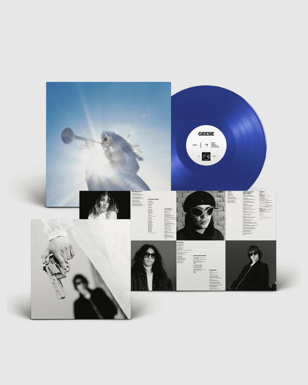
The tour poster in particular pushes hard in the opposite direction: heavy condensed black type, band photos in a flat row across the top and almost nothing else. It's blunt in a way the photography isn't, and the contrast between the two registers is doing a lot of work across the system.
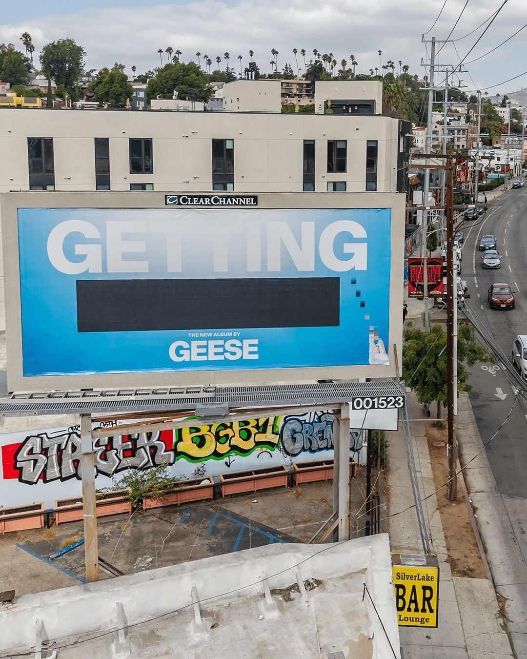
There are a few moments across the campaign where imagery or text is partially obscured or cut off. It's a small detail but I noticed it in a few different places. For a record with a title this loaded, withholding a little feels consistent with the logic of the whole thing.
Design & Creative Direction by Phil Gibson