A Festival Identity With Less Noise
Apr 6, 2025 · Jack Sheehy
Doel, a small village just outside Antwerp, has become home to one of the more unusual music festivals in Europe. Once home to more than 800 people, the town slowly emptied over the years due to prolonged political uncertainty. What remains is a mix of beautiful architecture alongside boarded-up windows, fading signage, and layers of graffiti.
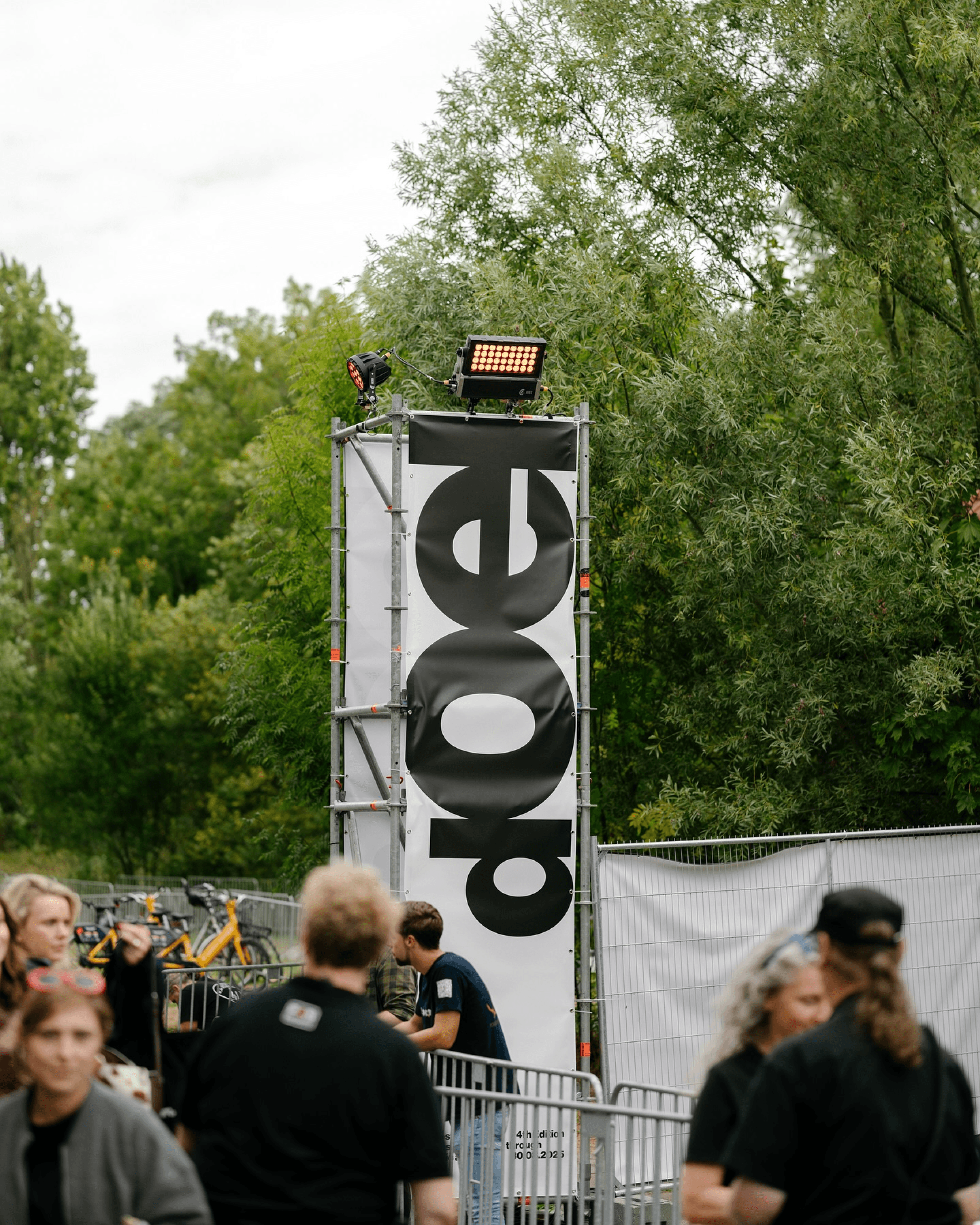
Rather than existing separately from the town, the festival is embedded into almost every part of it. The setting is unavoidable and the history feels hard to ignore.
The most recent identity, designed by Antwerp-based studio Vrints-Kolsteren, takes a noticeably restrained approach. Most festival identities lean toward heavy colour palettes and decorative graphics. This system is almost entirely monochrome. Black-and-white typography does most of the work, supported by playful but controlled motion.
The restraint feels intentional. In a place already dense with visual information, both from the town itself and the festival activity, adding another loud graphic layer would risk competing with the environment. Instead the identity steps back, allowing the setting to stay prominent. The system extends across posters, announcements, wayfinding and other touchpoints, staying consistent throughout. Typography is expressive without becoming chaotic, animated just enough to give the festival a clear personality. Nothing feels added purely for decoration.
What's interesting looking across the editions is how the identity has evolved without losing its grounding. The earlier editions drew more directly from Doel's history and texture. The most recent iteration pulls back further, functioning more like a frame for the village than a statement about it. Both directions work, but there's a growing confidence in the restraint.

With the fifth edition confirmed for July 2026, it'll be worth seeing whether that restraint holds or shifts again. Vrints-Kolsteren are returning, so the language will likely stay consistent. But each edition has moved, even subtly, and that continuity alongside change is part of what makes it worth following. Most festival identities try to outdo their surroundings, but this one doesn’t. The result is a system that feels specific to Doel, shaped by where it exists instead of being designed in isolation.
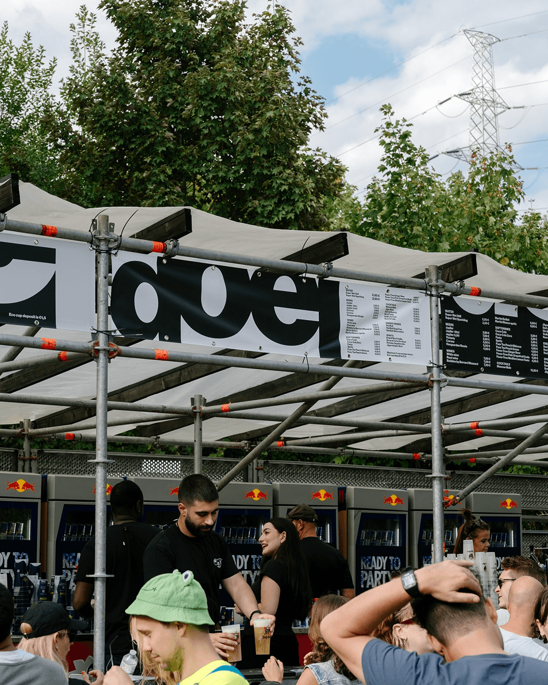
Design by Vrints-Kolsteren w/ Nicoló Oriani Motion by Vlad Boyko Cover featuring Alexandre Bavard